Friday, 24 July 2015

Close up and Wide angle Work Diary

We were set with the task of photographing close up and wide angle images. First of all I felt that it was important that I distinguish between the two, since I originally assumed that they were two o the same method. I found upon my research that it is the close up that shows details of the image from a close range while wide angle tends to warp the image, creating an interesting effect. It was only until the end of the shoot that I truly understood the differences between the two methods so I wasn't able to explore all of the subjects that I want to now photograph. I wanted to incorporate formal elements into my shoot but due to some time constraints, I wasn't able to explore suitable environments and subjects in time.


This image shows an example of wide angle photography. We can clearly see how the item within the image is affected by the method. The side closest to the camera appears abnormally large and distorted. I was also able to incorporate the formal element of depth into the image on a small scale as you can see the keyboard shrink over a certain distance.


This image shows an example of close up photography. This method allows me to explore intricate details within an image that could not normally be seen. Here we can see the details of the multiple faces within the watch, all the way down to the stitching within the leather strap. I wanted to use a black and white filter in order to show form and tone. We can see the shadows that are cast by individual parts of the watch as well as the tone of the strap in a way that would be impossible without this technique.

Progression:

If I were to do this shoot again I would make a number of changes. I would use my new understanding of the differences between the two topics to create more visually diverse work. I would use different locations in order to create more diversity within my shoot. I would also like to reshoot the wide angle images, using a range of different plants, people and objects.

Tuesday, 21 July 2015

Minimum Depth of Field Work Diary


We were set with the task of capturing minimum depth of field in our environment. The method to achieve the end result was easy enough to understand, the only problem being the amount of time that we spent shooting. I was only able to obtain a few images so I took it upon myself to shoot again from home in order to have more of a variety within my images. I utilised this opportunity to photograph something other than humans. Instead, I opted to use plant life as another example of how I could efficiently use the method for different purposes. Though the two shoots I was also able to incorporate more formal elements in my shoots than I would have previously been able to.


This image shows how you can use minimum depth of field in order to make a person stand out from the rest of the image. Without minimum depth of field, the person could merge with the background, making it less interesting image as a result. The effect causes the person to stand out in a way that gently fades the background, giving the image softer tones as a result. As a result the audience is immediately drawn to the face of the person without having to sacrifice an interesting background.


This image shows how minimum depth of field can be used on a smaller scale with plant life. The minimum depth of field is used to enhance other formal elements within the image in order to create a more striking image. The focus is placed on the bright colour of the plant to the left of the frame, the way that the colour is brought out from the dull background creates more of a contrast within the image. This combines in a way that allows me to control where I want to direct the audiences attention.

Progression:

If I were to do this shoot again I would have done a longer shoot and looked for different objects to photograph in different locations. I could include graffiti backgrounds and blur them in order to create a colourful background for the people to stand out against. I could photograph common items that I want to exaggerate in different ways in my images also, or I could photograph objects within the environment associated with them.


Monday, 20 July 2015

Work Diary Image within an Image


We were set with the task of researching and capturing image within an image photography. We had to capture the subject in three of it's forms, standard image within an image, removing the background behind an image and one where you place a video within an image. The three were fairly easy to capture and edit, the main problem was coming up with interesting locations and ideas for the images. I attempted to experiment with the formula as much as I could by introducing formal elements where I could and try not to repeat myself too much.


This image shows a straight forward example of image within an image photography. I like this image because of how detailed it is. You may not be able to see it but the image continues to cycle between images up until the individual pixels are present on the screen. I also attempted to introduce some formal elements into the image. I wanted to show tone by adding black and white but then I had the idea to create a contrast/pattern within the image by switching between colour and black and white as the images cycled.


This image shows another simple example of image within an image photography. Although this image appears to be fairly straightforward there is some interesting factors hidden within the image. The image features a large theme of contrast as can be seen with the obvious missing space out of the person. This theme continues as there is a constant clash of muted and natural colours within the image. Also the housing in the background creating a contrast of nature and urban environments.

Progression:

If I were to do this shoot again I would select some more interesting examples of image within an image photography. I would like use some interesting graffiti in order to fill the space in the person. This would help add some more of the formal elements into the image while making the effect more visually interesting as a result. Now I am familiar with the method, I would also like to challenge myself by creating more challenging examples that would take place in different locations and in different poses/framing.


Close up Image Bank


These two images show two different examples of close up photography on alternate scales. The first image features a close up of a man's entire face. The use of close up allows for more detail to be seen within the face of the person. Now the audience can see impurities in the face, as well as the texture of the skin. This would not be possible to obtain this amount of detail in a normal image. The second image is a more zoomed in close up of a person's face. Here we can see even more detail than we could in the previous image, bringing elements such as reflection into play, creating a more interesting end result.


Close up photography allows for a much more different range of results than a normal image could offer. This method of photography is usually utilised by photographers who look to capture small scale subjects such as plant life. Through this alternative approach, photographers are able to obtain a high level of detail within an image. We can use these images to observe details that are not commonly seen by the human eye and analyse the patterns that form within the structures. Close up photography can also be used on humans in order to highlight facial expressions, and impurities. The same patterns can be seen through photographs of iris's that could not be seen in a standard image.

Wide Angle Image Bank


These two images depict similar methods of wide angle photography in two different end results. The first images feature a landscape shot. The wide angle allows for more information to be stored within the frame. The image uses the tree as the focal point, the wide angle compliments this as the lines in the field appear to be converging onto the tree as a result, enhancing the sense of distance within the image as a result. The second picture uses some of the same methods in order to give the image a sense of scale. The converging lines are enhanced as a result, making the structure seem even larger than it normally would in a photo.


Wide angle photography can be essential in order to achieve some varying, interesting results. A wide  angle photo, in its most basic form can be used in order to distort a standard image. This can be useful in order to have more detailed images, filled with more detail and visual information. A more practical purpose for distorting images can be seen above. A wide angle can be used to distort the image in a way that makes the object within the image appear larger. This method can be used in order to enhance the effect of distance, or highlight a sific area of the image within the image.

Tuesday, 14 July 2015

Location Portraiture Image Bank


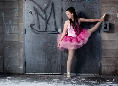
These two images show two different examples of location photography that are used to communicate different messages to the audience. The first image uses it's environment in order to create a vast theme of contrast. The background is dirty, old and littered with graffiti. Contrast is created by having a young ballerina stand within the frame. The young ballerina offers connotations to purity and innocence which causes her to stand out against the background in away that would be harder to do within a studio. The second image utilises the location to create a story within the frame. The images on the wall with the man in the middle almost act as chapters of the person's life. We can see when he was young, his wife, his children and maybe even his grandkids, revealing a detailed story within a single image.


Location portraiture is an alternative means of taking photos that many photographers utilise in unique ways to achieve amazing results. A most basic benefit of using location portraiture is simply due to the interesting backdrops that can be found to make an image more interesting to one that was taken within a studio. A more thoughtful example of location portraiture can be used to show contrasts and other formal elements in a more visually interesting way. Locations can be used to tell entire stories within a single image, revealing their culture or even revealing details of their life. This is quite an expansive topic if you are willing to place thought into your photographs in order to tell a larger story.

Close up Straight Images


Wide Angle Straight Images


Monday, 13 July 2015

Multiple Flash Image Bank


These two images show both a complex and a simple example of multiple flash. The first image shows how multiple flash can be used to create an interesting end result, filling the image with a number of copies of himself. The result is an almost haunting effect by leaving only a short time between each position. The second image shows an example of how multiple flash can be used to capture movement. This method can also be used to determine speed within the image, the slowest points in the image being more solid while the more faded parts of the image being the fastest.


Multiple flash is quite a diverse subject which can offer a lot of interesting end results. Multiple flash relies on a low shutter speed in order to capture the object and the moment within the frame. The most simple example of multiple flash can be used in order to show movement within an image. This method for capturing movement offers a much more detailed range of movement. This can be used to document sports such as snowboarding or skateboarding. A more complex form of multiple flash can be used to show a person interacting with multiple copies of themselves. This method can also be used to tell a story or show a range of emotions.

Multiple Imagery Image Bank


These two images show the difference between multiple imagery in its simple and most complex form. The first image shows hundreds of images in a collection to form a large image. Since the theme of the image is eyes, an eye has been composed out of smaller images of eyes. This technique is more complicated as it involves the manipulation of hundreds of images, altering the colour tones in order to create a large image. The second image shows a simple example of multiple imagery. This technique allows for photographers to show an ordinary object in an interesting way by making the overall image appear disjointed. The audience can also see more detailed areas which they wouldn't have seen before.


Multiple imagery is the use of a seres of photographs to create a collage. This technique can be used in many different ways, depending on what the image is attempting to achieve. Multiple imagery in it's most basic form can be used to show a collection of images from a single shoot. More complex examples of multiple imagery can be used in order to show a single object or person in a disjointed way or to reveal more aspects of a subject which the audience would not be able to see in a standard image without this technique. Some other methods can be used to tell a story or show factors changing within a series of images. The most complicated example of multiple imagery features the use of hundreds or thousands of images in order to make a large image. 


Monday, 6 July 2015

Illustrated Project Proposal- Hyperreality

For one of my ideas that I thought I could translate over the course of the year I wanted to look into the idea of hyperreality.  Hyperreality is a theory that usually corresponds with media. This is an idea of a falsified world that is censored and depicted by the media, this can take place in the form of raised standards of human appearance through alterations in photoshop to censorship in media such as the news which has been 'mediated' for audiences. The vast contrast between the exciting hyperreality that has become envisioned by mass media consumers and the typically boring everyday life of an average person is something that I think can offer some visually interesting results.
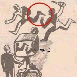
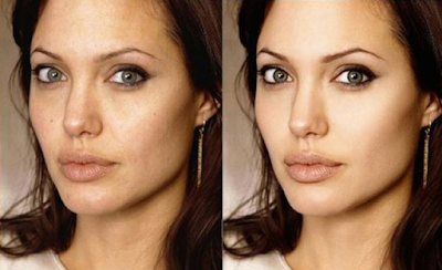

These two images show examples of how hyperreality can affect and change the way in which we interpret an image by adjusting or concealing certain aspects. As a result the story of a picture can be completely altered while our world of everyday humans appear bland in comparison to the one set up within the hyperreality. This is the type of themes that I would like to explore within the topics. I would like to tell visual stories through a hyperreality. I would also like to explore the implications it has on everyday life.
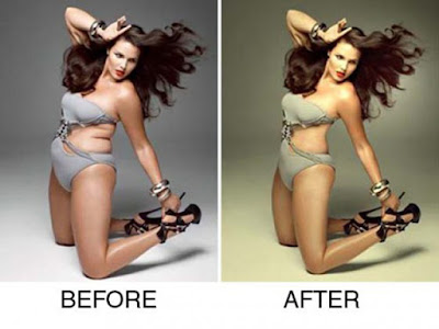


First of all I would like to explore identity within this hyperreality. I think this could be a great starting point. I can start off by using my photoshop skills in order to dive straight into all of the creative options that fall within this subject. I will attempt to create different examples of people who's image have been digitally enhanced by removing any blemishes or other features and enhancing other features such as eye colour, definition in the face or jawline or teeth whiteness as an example. The goal at the end of this will be to create an idea that is not an accurate representation of the real person anymore as they slowly become more of a concept instead of a person. I will use this to explore some formal elements such as contrast by comparing the untouched version against the photoshopped version.


Another subject that I would like to focus on within this idea of hyperreality is censorship and mediation. I think this would be a nice transition from the previous topic as I will be able to incorporate storytelling and layers of meaning within the images. I would like to set up exaggerated examples of how media can control what the audiences interpret. I would like to focus on censorship as well as perspectives to show an accurate representation of how the story can be dictated by the person telling it. I could explore this idea further by taking scenes and situations and using censors to change the context, for example a criminal switching places with an innocent person. I could even incorporate interesting methods within this topic such as silhouettes.
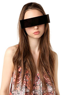


Even an image as simple as the one above gives me numerous ideas of different messages and can show through a similar technique. An idea that I would like to explore would utilise the black bar across the eyes as a way of censoring the person from seeing everything happening around them. I could explore this in more of a visually interesting way by including the violence and reality of the world around the person.

Banksy:


A massive inspiration for me within this subject is not a photographer. Instead, I have chosen the work of street-artist Banksy as a huge inspiration on my work and ideas.


I have chosen to focus my attention to a street artist instead of a photographer as it is clear from the vivid imagery within his art that he is exploring themes that are very contextually aware/relevant. He expresses a unique visual style that depict hidden meanings and messages that I would like to attempt to replicate in some form within my work. I think I could translate this style of striking imagery in relation to some of the censorship work in which I would like to explore.

James White:


James White is a fashion photographer who is based in London. He, like many fashion photographers  create the vast expectations of people that is preset within a hyperreality. 


James White's work stood out to me because he was able to capture some interesting celebrity portraiture, I felt his work would be a good reference point of how I would need to edit some of my images in order to fit the required media standards. James' work would fit with the identity photography that I would like to focus on at the beginning of my topic. I would need to replicate some of the photoshop techniques used in order to define features while hiding any undesired parts of the image.