Monday, 29 February 2016
Monday, 22 February 2016
Sunday, 21 February 2016
Shoot 9 Work Diary
For this shoot I wanted to continue my work in the more visual and stylistic aspects of hyperreality as a subject instead of metaphorical. This work into hyperreality is directly inspired by the photographer Cedric Delsaux and his work into Star Wars related photography. I have attempted to replicate this through the same use of miniatures and have decided to blend them into real world environments. An image from Delsaux which acted as a major influence was one which features an AT-AT from Star Wars. The most notable thing about this image was the fact that the AT-AT contrasted so heavily with the environment that it highlighted how dull the real world is compared to the fantasy world of star wars. The image was presented through gritty, realistic colours that appear almost muted. This influenced me as I could directly link these themes to the subject of hyperreality and the way that the heightened world of the media contrasts with our reality. Also I wanted to develop this idea and explore how reality and hyperreality can be blurred together through this technique and how ideas of hyperealities can affect the way we perceive the real world. I was going to achieve this shoot by using a combination of landscape photography and small-scale miniature photography. The landscape shoots would vary, however it was the miniatures that would be the key to making the effect convincing. I adjusted my camera settings in order to match the settings required to take a detailed image on a small-scale. I was taking these miniatures with low light so I compensated by using a shutter speed of 1/20, an f stop of 16 and an ISO of 600. This would allow me to achieve the required detail within the image on a small scale.
Cedric Delsaux influence:
Cedric Delsaux influence:
My images:
This image features a busy area within New York. I have purposely chosen this heavily advertised area as advertisement plays such a heavy role within the subject of hyperreality. I have chosen to add a toy of the bat mobile in order to enhance the image. I have given the model more authenticity by matching the lighting and adding the flame within the exhaust. I to use a toy as it draws connotations to imagination which blends seamlessly into the real world, making it difficult to distinguish between the two.
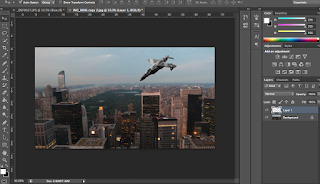
This image features a more realistic attempt at the method by placing a model of a plane within the image. I adjusted the lighting within the image in order to more accurately depict what a figure in the sky would look like. The smoke trail implies that the plane is broken but at the same time it provides scale and a sense of believability to the audience. The black and white tones were used in order to create contrasts within the skyline, highlighting what I wanted audiences to see.
To begin, I used the quick selection tool in order to highlight the model. I then copied and pasted the image onto the background which I wanted to use. In order to match the gritty tones that can be seen within the work of Cedric Delsaux, I used a black and white filter once I had framed the object correctly.
I then adjusted aspects of the black and white filter. I wanted to create darker tones within the image in order to offer connotations of dullness. I also wanted to make the sky darker in order to believably contrast the model from the sky. I then made the object darker through the use of brightness and contrast. Once this was completed I slightly dropped the opacity of the object to 76% in order to blend the two images together better. I then used a brush tool to simulate the effect of a trail of smoke leaving the plane.
Progression:
This shoot worked out well and I was able to accurately replicate the types of photographs that Cedric Delsaux has taken. However, the success of the shoot has made me curious about where else I could have taken the technique. If I were to do the shoot again I would like to experiment by using people within the image and changing their size. I would also like to have experimented with different weather types such as fog in order to blend the images just as Delsaux had previously done.
Shoot 8 Work Diary
For this shoot I wanted to experiment with photographic realities by enhancing them in new and unique ways. Instead of focusing on how the public commonly fall victim to deception from the media, I instead wanted to focus on a more stylised approach, highlighting how our reality can be enhanced greatly and made more exciting as a result. I thought about different ways in which I could achieve this effect but then I thought of how drawing can inspire connotations to creativity and fictitious worlds that have been constructed. A massive inspiration for this shoot was Helmut Jacoby's work based on Milton Keynes, particularly one image which focuses on a busy landscape. Despite being a fairly standard setting, the sketched format causes the image to appear more exciting, causing the audience to view a familiar setting in a different way. This gave me the visual premise for the style of the image as it could be translated directly into the subject of hyperreality by showing a standard setting in a more visually interesting way than can be seen in reality.
Helmut Jacoby influence:
Helmut Jacoby influence:
My images:
This image of what may be considered bland and a part of everyday life is transformed into something more. Because people are used to seeing sights like this, a lot of information within the image is lost, however with the added effect of the drawing style, small details start to become more prominent. Patterns can be seen throughout the image within buildings which give the image a more stylised appearance. Detail within the image can be seen even within the distance which would have been lost within the original image.
For this effect I first made sure to create a copy of the background layer. I then added a black and white filter. I then used the copy of the background layer and switched the blend mode to colour dodge. When this is done I inverted the layer by clicking cmd I. This causes the image to appear completely white apart from the very dark tones.
Once this step was completed I could now focus on blurring the darker tones in order to create the effect. I created a smart object on the copy layer in order to allow me to go back and adjust the effect any time I wanted. I went to filter-blur-gaussian blur and began adjusting the effect. I chose to keep the pixel radius at around 24.7 in order to create a convincing art-style effect.
This image offers a more chaotic variation using the same technique. The image consists of a collection of trees within a park. As a result of the effect, an endless pattern is created which may have been lost without the added contrast of the black and white tones. More information can be given within the image as a result of the effect. The lines on the ground give the audience information to factors such as the seemingly uneven texture, through the use of lines.
Progress:
This shoot has introduced me to a new and visually striking idea and I have managed to use this within varying environments. As a result I would potentially like to continue my investigation into the stylistic side of the hyperreality subject. I could look into other photoshop techniques in order to make images appear more unbelievable. If I were to develop this shoot, I would perhaps introduce colour in order to further create a more heightened/exciting version of reality.
Animation Work Diary
For this shoot we were set with the task of completing an animation. For this I wanted to experiment with two different methods of showing this technique. To achieve the basic requirements of this technique I needed to take a series of photographs which could all seamlessly blend within one another. For this I needed to bring a tripod to shoot with in order to ensure an easier editing process within Photoshop.
This image shows a rather simple variation on animation. For this image I wanted to explore two vast contrasts and blend them within the same animation. For the contrast, I used vivid, oversaturated colours and turned them into a desaturated, black and white image. This image relied heavily on the use of Photoshop in order to achieve the vastly different colours. The effect allows the audience to slowly break down each phase of the image. First they can see the vivid colours that then begin to fade into the original image, the final result gradually reduces the colour within the image. This effect can cause connotations to be made between happiness transitioning to sadness.
This animation shows progression from the last as it attempts a more complex technique. This was accomplished using a tripod with the camera in order to take a series of photographs. Each image is made to transition into each other in a way that creates a sense of motion. I had purposely chosen the park ride in an effort to blend the end of the series of images. This results in a seemingly endless loop of movement within the image.
Progress:
The techniques worked well within their intended purpose, however I would like to have experimented more with more complex examples of the technique as I now have more of a grasp on the method. I could potentially make small film-like stories that would play out over the course of a few seconds.
High Key- Techniques Page
The idea for a high key shoot is to separate the subject from their background, producing a crisp image of the person. The image above gives some clear indications as to how different lights and boards can be used to achieve this. The lights in front of the subject are used to light their face, while the boards also allow for the light to bounce off onto the back and side of the subject. The lights in the back of the image are set up to light the background by bouncing the light off of the board; some lights can just face the background directly in order to light it. The result causes the subject and background to be lighted independently from one another. The white background used within the image should become brighter as a result, causing the image to remain clearer and the contrast between background and subject more crisp. The face should appear well lit, allowing for the skin to appear smooth but not too bright as the indirect light within the image will create a soft, even light to the image. The light readings for the background would be set at f11 while the subject was f16. This would ensure that the background would remain independent from the subject, creating an all white background effect. I would use a shutter speed of 1/125, an f stop of 16 and an ISO of 200. These settings are crucial to ensure that a lower amount of light goes through the lens to cause the image to not appear over exposed. The f stop of 16 would allow a controlled amount of light to go into the lens in order to ensure that the image was not over exposed.
This is an example of what can be achieved within this technique.
Friday, 19 February 2016
Thursday, 11 February 2016
Subscribe to:
Comments (Atom)


