Sunday, 24 April 2016
Tuesday, 19 April 2016
Shoot 10 Work Diary
For this shoot, I wanted to push my skills within a studio environment in order to display some strong portraiture. I got inspiration for a shoot when I saw a piece of art from, graffiti artist, Banksy. The image featured a couple who are holding each other, however their attention is diverted by their phone screens. I thought this was extremely powerful and I knew that I could use some methods within the studio through lighting in order to create a similar effect. I wanted to think about composition in order to communicate an idea of how everyone is so immersed within a media world and how everyone may be present in body but not in mind as they diverge into social media. It is a massive subject that is often debated. Its relevance, especially as technology has greatly advanced and the world has socially grown smaller. I wanted to focus on contrast as a key theme in order to make the image more visually striking as well as to make the message abundantly clearer. I also wanted to add some other themes that I have explored through hyperreality by changing the intensity and tone of the light in order to replicate the Banksy art style and to make the image/contrast more dramatic. To achieve the effect that I wanted to use, I had a two light set up. One light had a soft box while the other light which would flash had a snoot. This would allow a small/softer light to be projected onto the face of the person in order to simulate a dramatised version of the light from a phone. I used a black background in order to create a sense of emptiness within the frame. I used a shutter speed of 250, and an ISO of 200. This would allow me to achieve a brightness which wouldn't cause the face/background to appear too overexposed while not causing the image to be too dark as I lose detail within the image to darkness.
Example from Banksy:
This image features a person taking a selfie. It is a common term which immediately offers connotations to the digital age and social media. It implies a sense of vanity/self obsession which causes people to build up a relationship with a digital world. The person within the image is smiling which contrasts with the dark tone of the image. This is used to imply that the person is happy within her social media life but in reality her life is extremely empty, as is represented with the use of black in the frame. I have enhanced this sense of emptiness through the use of composition by ensuring a large portion of the image to be engulfed in darkness.

Initially, the image, while dark did not reflect the extremely dramatised glare effect from the phone that I wanted. To start, I applied the pale blue light effect to the image through the use of the photo filter. In order to give the sense that the light was coming straight from the phone, I removed the blue tint through the use of the brush tool and began removing areas that were out of reach of the phone's light.

I wanted to pull the shadows from around the face into the centre of the image, to give the impression that the darkness is engulfing the person. I wanted to exaggerate this more and in order to exaggerate the fact that the only light within the frame was coming from the phone. I used a black brush with a hardness of 54% in order to create shadows around the light of the phone. I used this technique for all of the images within the shoot, however I liked the pose of the person within the frame on this image however I believed that the image would be composed better if the subject was more central. I took the lasso tool and looped it around the area that I wished to change. I copied and pasted the selection, then proceeded to paint the background black in order to remove the old position. I feel this composition works much better.
This image promotes the same method and visual style. This image features a much more personal, central composition which uses low light within an extremely dark background. The expression and posture of the person resembles someone who is reading a text. This is a common sight, however the use of light and contrast implies that the phone is the only bit of light in her life, as everything around her fades into obscurity. The composition reflects this as there is a great amount of darkness in the remainder of the frame.
Progression:
Monday, 18 April 2016
Sunday, 17 April 2016
Computer Experiments
Experiment 1:


Experiment 2:
Experiment 3:
Experiment 4:
The above effects can be used in order to take a familiar premise of portraiture and make them appear otherworldly and extremely stylistic. Some of these techniques are purposefully remminisance of pop culture and pop art that was prominent during the 60s. This is done to enhance the audience's experience with the image, much like pop art would in advertisement or other examples of media.
Experiment 5:
This combination of text and image could be utilised within hyperreality as a way of mentioning words associated to a key issue such as body image. The image itself features an example of a person who has been digitally airbrushed in order to define features and create a more media-accurate representation of a person.
Experiment 6:
This slightly glitched effect gives the effect of a television acting strange. This could be used to imply a digital world beginning to blend with our reality.
Experiment 7:
This image attempts to introduce audiences to the world in a familiar format. A colour grade has been applied to the image along with the use of black bars in order to give the image a more cinematic composition. The image immediatley looks more appealing/exciting. While it may not be obvious within a first glance, the image appears believeble, however this image represents how audiences are easily willing to accept a representation of reality that has been generated by the media. Even a slight detail such as the tones of colours present within the image are false. Real life appears much more dull with mainly grey tones present while this representation features green tinted sky and bright orange building lights.
Experiment 8:
This image features the use of a simple effect of posterising. I have used this in order to create massive contrasts within the frame, leaving everything dark apart from the advertisements and examples of media. This is used to show the audience clearly how much the media dictates our lives by the way that it overwhelms the frame.
Experiment 9:
This image utilises saturation and tone in order to make an image similar to one that may be seen in a magazine. Small details have been enhanced from the tone of the hair to a more unrealistic blonde to the lipstick to a brighter tone that coincides with the background. Even the brown eyes have been changed to a ocean blue shade. The image is an attempt of showing how easily the media can manipulate an image into achieving a Barbie-like representation.
Experiment 10:
This image uses selective colour in a way that highlights the prominence of media within our lives. This effect can also be used to show how the media world is exciting (shown through the use of colour) while the real world is very dull in comparison (shown through the use of black and white tones).
Friday, 15 April 2016
Print Techniques
Image within an image:
This final example shows an example of how image within an image can be applied to the subject of hyperreality. This allows the image to be separated into two aspects. The world within the television is colourful and full of information while the surrounding area is black and white. This can imply that the world that is presented to us through television is much more exciting than the real world.
Image and Text:
This technique shows how heavy themes within hyperreality can be explored through the use of image and text. Font and colour can be used as well as an image within the text in order to reveal a key issue within the media. The colour of a light pink offers connotations to vanity while the image within the text utilises some of the airbrush techniques that are featured within the media.
Weaving:
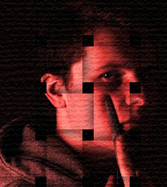
This technique can be applied in order to present something ordinary in a heightened way, possibly to make the representation of reality more exciting.
Duotone:
Duo tone can be featured within the subject of hyperreality through the use of the techniques manipulation of colour. Within this example, the colour of blue has been used in order to emphasise an emotion within the image. Blue offers connotations to sadness, which combined with the image gives the impression of the emotion. This can feature within hyperreality as it demonstrates how Photoshop can manipulate the way in which an audience perceives an image.
Overlay:
This technique, similarly to multiple exposure can be used to see what is going through the person within the photo's mind. The audience can see a faded city street, fading into an empty background. This implies that a reality is being generated in the mind of the person, however the reality of the person is empty. This represents the contrast of the media generated reality and our dull reality.
Selective Colour:
This use of selective colour can be used to draw attention to a specific area of the image. The environment appears very dull in comparison to the person. This contrast in colour is used in order to show a boring reality compared to the enhanced reality being generated by the person's mind.
Repetition:
This repetition technique can be used within the hyperreality for the way in which it presents reality. The world is enhanced dramatically and the grittiness of reality appears to have been replaced by a clean appearance. It appears as if the water is extremely clean and reflective, while the structure of the buildings over the water appears slightly odd and out of the ordinary. The result creates a hyperreality unlike the real world.
Montage:
Montage is a fundamental technique for using Photoshop within hyperreality. Especially within the work of Staudinger Franke, montage can be used in order to create a surreal reality by combining different images on different scales.
Framing:
Framing can be used in order to direct an audience's attention or create contrast. Within this example, I have done both in order to bring attention to the contrast. The frame is used to represent hyperreality which is oversaturated. Reality is represented through the remainder of the frame which is black and white, which highlights the differences between the dull reality and the exciting hyperreality that is constructed by the media.
Cluster:
Subscribe to:
Posts (Atom)


