Example of Staudinger Franke's use of unique colours:
This image just simply shows how bland real life looks compared to the one that is represented through edits. Grey skies turn to blue, and brown trees turn into a pallet of different colours. Since this image is merely enhancing the components of our reality, it would be easier to dismiss the dull reality and assume that the colourful one is our own. It is only as we compare the two that we begin to notice that the reality in our minds are vastly different to the ones in real life. A challenge while shooting the base image for the effect was the weather. I had chosen a day which has cloudy skies in order to make the environment look even more gloomy. As a result the sky would appear over exposed. In order to compensate for this without adding too much contrast to my image, I kept a shutter speed of 149 and an ISO of 400. This created the balanced image that I wanted to achieve because if the image had more contrast then the image wouldn't look as tonally dull.
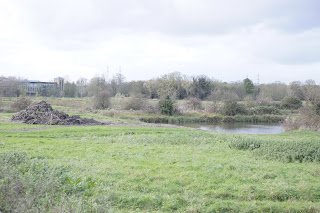
To begin, I chose a dull image where the colour appears to be largely muted. I believed that this could help show the largest contrast between the final effect.
I decided that I wanted to create a more striking contrast by including the image with and without the effect. I achieved this by using the marquee tool to split the image diagonally, knowing that the saturation would only affect the elected area.
I began adjusting the saturation within the frame. It was important that the media reality was represented dramatically so I purposefully oversaturated the image in order to make the effect seem exaggerated. This helps to enhance the final contrast while making the media world appear completely put of the ordinary, and exciting.
This image highlights the contrasts between the two images. Through simple changes, I have changed an environment that may initially appear gritty, dull and litter filled environment into a healthy landscape. I managed to fool the audience into believing that this was a healthy field by removing litter and patches of mud along with enhanced colours. In order to create further contrast, I adjusted my settings in camera in order to dull the image. I had a shutter speed of 60 along with an ISO of 200. This would allow the tone of the colours within the frame to appear darker, allowing me to create a greater contrast when I adjusted the saturation within Photoshop.
I took a similar approach with this image, except I wanted to highlight how the media might censor aspects of reality that may not fit with the final image. As a result, I represented this through the use of the beer can that is present within the left of the frame. I used the lasso tool, cropped out a section of grass and pasted it down multiple times. I blended the effect by using the eraser tool, with the hardness of the brush set to 80%. A softer eraser would help me to blend each image more seamlessly. I wanted to use the same piece of grass over and over for the cover up in order to create a pattern within the image. I hoped that it would make the image appear purposefully manipulated and false, through obvious repetition.
Progression:
This shoot has taught me some techniques in order to make an image appear different to how it originally appeared by changing a few aspects. If I were to do this shoot again, I would like to experiment with urban landscapes in order to explore a different side to this type of hyperreality. For future shoots I would like to keep this idea of creating a believable hyperreality through portraiture instead. This is a very common form of hyperreality that people see every day in magazines but instead believe it to be their reality instead.


shutter speed1/60 s
ReplyDeletethis shows good progression conceptually and in terms of the development of skill in Photoshop
ReplyDelete