Thursday, 28 January 2016
Wednesday, 27 January 2016
Video-Techniques Page
- Use a tripod to ensure a steady image
- Begin recording
- Take the footage into an editing software such as Premiere Pro
I used video to create image within an image:
- In Premiere pro use a screenshot or photograph and place it into the video timeline
- Scale down the image and size it into the image that you want
- Begin cropping the length of the video to the desired amount
Multiple Exposure-Techniques pages
Multiple exposure can be achieved in or out of the studio, however the editing process is made easier if the subject is photographed on a white background. You need to ensure that the portraits are well lit enough to salvage details of the face within the editing process. You can achieve this by using a shutter speed of 1/125, an ISO of 200 and an f stop of 11. Portraits should be taken as they typically easier to compose with the background. First you should create a copy of the background layer of the portrait image and then made the lowest layer white. You should create a layer mask and use a black brush with a hardness of 80% in order to remove the background. You should create a rough edit and then use the select tool and used refine edges in order to smooth the mask. Then paste your landscape image into a new layer at the top of the image. Adjust the scale and position of the image in order to fit the composition you want after creating a clipping mask in order to cause the image to fill the silhouette. In order to make some areas of the face present, you can drop the opacity to 82%.
Connecting Essay 1
This image is from the magazine Redbook, a womens magazine which specialises in fashion, healthy eating and keeping your body in good condition. In order to appeal to this target audience, an attractive woman was placed on the front cover in an effort to convince the audience that they can look like this woman. Airbrush techniques have been used in order to make her skin appear smoother and wrinkles have been removed in order to make her appear younger. The model's arms have also been made skinnier in order to make her appear more attractive. The woman becomes a goal for many members of the audience to achieve as they begin to believe that they can achieve this look and lifestyle if they buy the magazine. The two images contrast dramatically against each other, causing the the edited one to appear fake, however this is a common form of hyperreality and commonly tricks audiences into believing that this is a real representation of a person.
This is one of my images. It features a simple portrait before and after the effects of Photoshop. The first image appears different to the last. Within the first image, the face appears pale and blemishes on the skin are apparent. The next image eradicates these features through the use of dodging and burning techniques. Areas of the face, such as the jawline, nose and cheek bones have been enhanced in order to give a more defined look to the face. A black and white filter has been used with soft light in order to create smoother tones within the images, removing contrast from the face and leaving it smooth.
Both of these images connect as they focus on the same subject matter. The same dodging, burning and airbrushing techniques are applied within both images to make the person seem closer to the model standard of appearance that is being featured in magazines and advertisement. Both images link under the same form of hyperreality which causes the audience to have misconceptions about what is a real and what is a fake representation of appearance. Each image strives to make the model more masculine or feminine as it is more accepted in the world of fashion photography. Both have negative effects on the audience as they cause them to strive to impossible standards.
Shoot 7 Multiple Exposure Work Diary
For this shoot I wanted to focus on a simple yet visually striking image that will convey how hyperreality is triggered through the thoughts of the other person. To achieve the type of visual style that I wanted to go for, I opted to focus on multiple exposure. This technique is popular among many photographers such as Andre de Frietas who use it as a means to explore the mind of the subject. I wanted to use one of his images as a critical influence for the creative direction which I would take the shoot. The image featured a girl whose expression matched what was going on in her head creating a small story for the audience. Her expression showed that she was almost daydreaming of a better place. This idea of a distraction from the real world quickly became the main theme for this shoot. For me this translated perfectly within the subject of hyperreality as I could explore themes that cause people to blend their outlook on life with the influence of the media within film. In order to evoke an otherworldly sensation I decided to use a shoot which I had done in New York. I did this as New York is one of the most documented cities on earth. It is commonly featured within films and other media so it made sense to use this as a contrast to the background. I would focus mainly on the use of contrast and compare an exciting, heightened world to a dull reality. For studio shoots, I only needed to keep a simple two light set-up with two soft boxes. I just needed to ensure that the portraits were well lit enough to salvage details of the face within the editing process. I had a shutter speed of 1/125, an ISO of 200 and an f stop of 11. These settings would allow me to capture well lit and detailed portraits. For the two images bellow, I captured the New York images at night. As I was dealing with a lack of light from the sky and fluorescent lights from advertisement I had to adjust m camera settings carefully. I used a shutter speed of 1/60, an f stop of 2 and an ISO of 40. This allowed me to capture a well lit image with good detail despite the lack of light.
Andre de Frietas influential image:
Andre de Frietas influential image:
My images:
This image shows how I wished to achieve the message that I wanted to get across. The person appears to contain all this excitement and colour while the surrounding background remains blank and empty. This shows that our ideas about the world can appear more extrodinary than the world really is. The image appears stylised like a film in order to show how the film world can influence a person's thoughts on the world around them.
I used this technique for almost all of the images. I created a copy of the background layer and then made the lowest layer white. I then created a layer mask and used a black brush with a hardness of 80% in order to remove the background. I created a rough edit and then used the select tool and used refine edges in order to smooth the mask.
I then pasted the New York image into a new layer at the top of the image. I adjusted the scale and position of the image in order to fit the composition I wanted after creating a clipping mask in order to cause the image to fill the silhouette. In order to make some areas of the face present, I dropped the opacity to 82%. Small facial features would help humanise the image and make the purpose more clear that the person is constructing the world within their mind through media representation.
This image explores the same premise but instead focuses more on the media. Within the image, we can see billboards and signs that have lots of bringing within them. They clutter the inside of the image in order to show how the influence of this branding can become a part of the person's ideology. This idea is enforced through the use of contrast. The bold colours stand out among the night sky of New York. These darker tones also create greater contrasts with the background, enforcing the idea that reality is empty in comparison to this fictional world.
Progression:
If I were to develop this shoot, I would utilise more landscape photography which would work with my current theme within the image. I would choose to photograph nature landscapes in order to create more variations within this style of photography. For my next shoot, I would like to develop this idea of altering perceptions of reality through the use of more Photoshop techniques.
Shoot 6 Work Diary
For this shoot, I wanted to explore a more exaggerated form of hyperreality. For this, I wished to explore emotion and how visual manipulation can be used in order to influence the audiences understanding of the people within the image. I wanted to focus on simple props and bold colours that are associated with the emotions that are being represented. In a contrast to my last shoot, I strayed away from realism and instead focused on surrealism, I wanted to make striking imagery while paying close attention to the way in which the techniques used can adjust perspective and enhance the audiences' opinions about the people within the image. I also realised that I hadn't yet had the opportunity to explore the subject of hyperreality through the use of portraiture apart from my airbrush photography. Since that was more Photoshop focused, I wanted to utilise more practical aspects within my second attempt to create visually striking portraiture. I believe that this would be the best way to explore my chosen themes as I can manipulate the area of the studio through the use of lighting and colour than I would be able to on location. I wanted to show the audience how easily the audience can be persuaded to view an image differently through simple manipulations which offer strong connotations to certain emotions and themes. For this shoot I wanted to use a one light set up, manoeuvring it depending on the effect that I wanted to give. I did this in order to enhance the presence of shadows within the image and use the connotations to make the audience view the image in a certain way. In order to properly photograph this low light image I adjusted my camera settings appropriately. I had a shutter speed of 125 with an F stop of 16 and an ISO of 200. This would allow me to maintain detail within the darkness of the image.
This image focuses on representing anger and rage. On its own, we can see a person holding a knife to his face. While this may appear unnerving, the emotions of the person may appear unclear. The light strikes one side of his face and casts a shadow, causing the rest of his face to become lost within the background. This use of shadows is used to imply that the person may have something to hide. I positioned the light close to the face of the person in order to create a low key lighting effect which would cause contrasts of light and shadow across his face. This would also allow me to blend the shadows and background in order to give a sense of mysteriousness. The contrast also draws more attention to the knife implying his intentions, while also casting shadows under his eyes in order to give a more deranged look. Finally a red colour becomes the main focus of the image which immediately offers connotations to emotions such as anger and rage.
First, I wanted to focus on the shadows within the image. The light set up which I had used was very effective and gave the image the right amount of shadow in the places that I wanted them. In order to exaggerate these shadows, I adjusted the levels within the image. I moved the middle slider to 0.80 in order to cause the shadows in the image to appear darker and surround the person. This would also allow half of the person's face to be removed through shadows, implying that he is mysterious and perhaps hiding something.
I used the photo filter with a deep red colour which would offer connotations to danger, blood and evil. I raised the effect to 100%. I then applied a curves layer in order to exaggerate the contrasts within the image, enhancing the effect
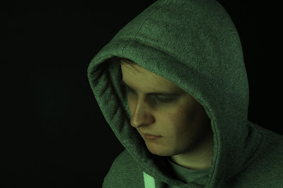
This image focuses on sadness and depression. While the positioning of the subject may imply that the person is feeling depressed, the other alterations to the image imply further that the person is depressed. A cool blue is used to draw connotations to sadness. The composition of the image leaves plenty of space around the subject, implying loneliness and isolation. The shadows help to emphasise this as they gradually overtake him and fade into the background, giving an overall emptiness to the image. This image may cause the audience to pity the person within the image. The point of this is that I was able to manipulate how the audience feels about the audience and the person within the image to the point where they pity him. This reflects how the media manipulates audience's perception of events and people through a similar manipulation, evoking certain emotions within the image. I used a similar set up within the studio, manipulating one light in order to enhance shadows. For this image however, I moved the light slightly further away in order to give softer tones to the image.
Progression:
Within this shoot, I learned a lot about how I can suggest ideas through visual manipulation. I am a fan of this over-stylised example of hyperreality, so for my next shoot I may attempt a similarly stylised example of hyperreality and maybe explore more metaphorical examples of the subject. As I have explored the use of location frequently within my previous shoots, I feel that I should continue to explore the subject of hyperreality through a combination of studio portraiture with a smaller focus on location. If I could develop this shoot in any way, I would probably focus on the censorship side of the media controlling how we view certain things. This could create some strong portraiture imagery as a result.
Shoot 4 Work Diary
For this shoot, I wanted to explore the colours that are shown within an outdoor setting. I went to shoot on a cloudy day in order to achieve the contrast with colours that I wanted to achieve. I wanted to take images of boring scenery and then I looked to enhance the tones and colours within the image in a way that causes the mundane to appear more vibrant. The colours that are featured within the image are not an accurate representation of the ones within the real environment, but these over saturated segments act in a way that enhances colours making them appear believably surreal. I was inspired when I saw a photograph from Alastair Magnaldo which shows workers framing a piece of a puzzle, in order to complete the image. I thought that I could use this technique in order to imply how hyperreality is constructed by the media like pieces to a puzzle which ultimately disguise our dull reality. I experimented with how I could reflect this message and tried two, alternate methods. The first utilised a simple selective colour method, choosing to make a small portion of the image coloured. While elements of the purpose within the image are present, I opted for a more visually striking method which is reminissant of the techniques present within the Alastair Magnaldo image. I wanted the shoot to take place on a very cloudy day. I felt that this would help mute the colours within the environment in order to give the impression that the real world was extremely dull. As a result I had to change my camera settings accordingly, in order to ensure the image would not appear overexposed with the bright white sky, and I also wanted to make sure I could capture enough detail within the image as I was dealing with less light. As a result, I chose a shutter speed of 400 with an ISO of 200. Occasionally I would change the shutter speed to around 125 depending on the state of the weather.
Image by Alastair Magnaldo:
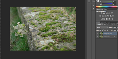
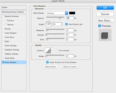
Image by Alastair Magnaldo:
Initial attempt:
This image focuses on contrasts. The black and white filter has been purposefully used in order to further desaturate the tones within the surrounding image. I wanted to give a sense that the hyperreality is being constructed in order to cover up the boredom of reality. I attempted to reflect this through the use of colour and tone. The reality is represented by the empty area within the frame. This is reflected through the use of a black and white filter which offer connotation to dullness. The hyperreality (rest of the frame) is represented in a completely opposite way with the use of oversaturated colours. This is used to give the sense of colours that do not naturally exist within the real world as they have been digitally enhanced. This creates a larger contrast which causes the effect to stand out more.


First, I made a duplicate layer of the background, then I made a selection which resembled a puzzle piece. I transformed and moved the selection until it matched the composition which I wanted. In order to give the puzzle piece a physical presence against the image I added a drop shadow to the layer. This would also help the piece stand out from its background.
In order to create the contrast between the hyperreality world and the real world I manipulated the colour within the image. I used a black and white filter to represent the real world. I began darkening each colour in order to imply dullness within the world. For the hyperreality world, I used hue/saturation in order to give the colours a vibrance which would contrast completely with the colours of the 'real world' within the image.
This image attempts to show how manipulation of an image can change the audiences perception of what makes up an image. The unedited surrounding of the image appears to be all one tone of dark brown colours. With the aid of some colour enhancement, the image now appears layered with multiple splashes of colour as opposed to a singular dull tone throughout the image. The use of a puzzle piece seemingly being placed into the space gives the impression that something is being covered up. In this sense, the use of this technique shows how the media attempts to change our perception of the real world by covering up the darkness with something more mediated.
Progression:
Within this shoot, I have focused largely on subtle examples of hyperreality and have revealed ways in which audiences can be misdirected into believing something looks different than what it really is. I have already developed this shoot as I managed to find what did not work within the images and find a way to update them through the use of more complex techniques which offer different connotations to a constructed media world. I think the next step should be to investigate the same premise of manipulation of images and audiences within the studio. I can look at how this misdirection can be found within humans by adjusting certain features in order to make them appear different than what they would usually appear. If I could develop this shoot further, I would take the same technique to a more urban setting in order to emphasise a grittiness to the image which could contrast heavily with a hyperreality that I will create.
Thursday, 21 January 2016
Wednesday, 20 January 2016
Location Portraiture- Techniques Pages
When photographing on location, aspects such as zoom and aperture should be considered in order to add some diversity to the images. Zooming less allows for more visual information to be stored within the frame while zooming in compresses the focal length, making the background of the image much more tight. The aperture can be set to the lowest f number in order to create the depth of field which can cause backgrounds to become interesting and your subject can stick out more from the image as a result. Depending on lighting within the environment, the ISO can be adjusted or a flash can be used in order ti ensure a crisp image.
Minimum Depth of Field- Techniques Page
To achieve minimum depth of field the aperture must be set to large. When adjusting the aperture, you have to consider the f number. As you have a larger aperture, you need to lower the f number. You must ensure that the shutter speed remains high in order to capture a
sharp image with the right depth. When you are shooting it is beneficial to have the subject closer to the camera. The closer the model is to the lens means a shallower depth of field can be achieved. Also, the model had to be positioned further away from the background for depth of field to be achieved. When capturing the image, allow your camera to focus onto the person that you are photographing and then adjust to your liking once the focusing has completed. The result should be a blurred background with a sharp subject in the foreground.
sharp image with the right depth. When you are shooting it is beneficial to have the subject closer to the camera. The closer the model is to the lens means a shallower depth of field can be achieved. Also, the model had to be positioned further away from the background for depth of field to be achieved. When capturing the image, allow your camera to focus onto the person that you are photographing and then adjust to your liking once the focusing has completed. The result should be a blurred background with a sharp subject in the foreground.
Subscribe to:
Comments (Atom)


